
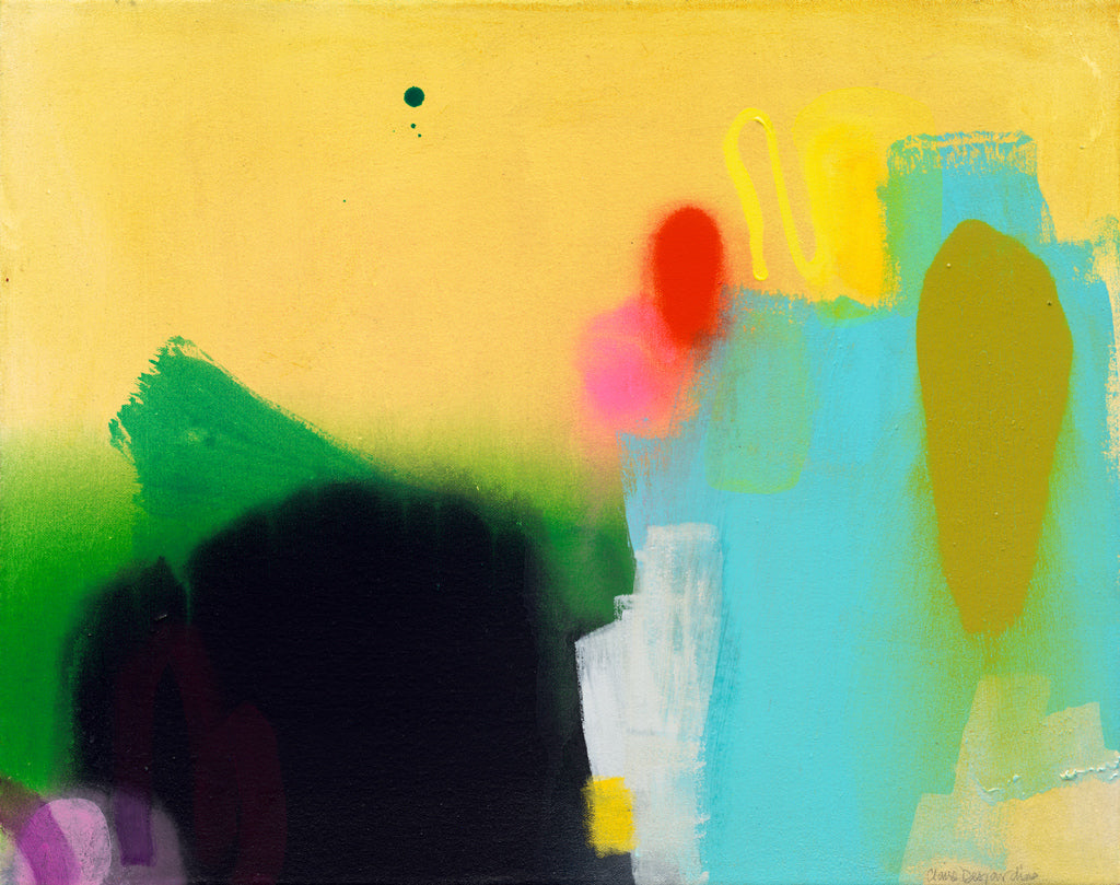
I want to chat about one of my favorite topics in abstract art: contrast. It's a powerful tool that can take your paintings to the next level, adding depth, interest, and visual impact. Whether you're a seasoned artist or just starting out, mastering contrast can truly elevate your work.
So, what exactly is contrast? In the world of art, contrast refers to the differences between elements in a composition. This can include variations in color, value, texture, shape, size, and more. By strategically incorporating contrasting elements into your paintings, you can create dynamic and eye-catching pieces that captivate viewers.
Here are a few tips on how to use contrast effectively in your abstract paintings:
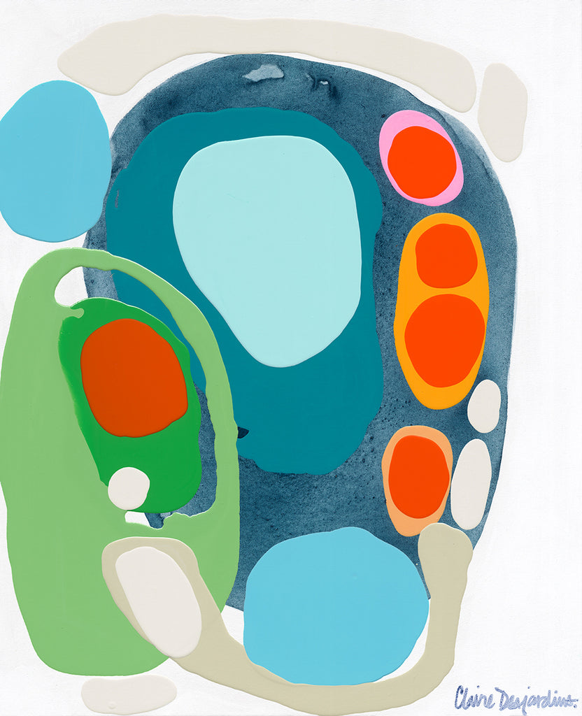
Play with Color
Experiment with pairing bold, saturated hues against softer, muted tones. Consider using complementary colors (those opposite each other on the color wheel) to create maximum contrast and visual interest. Don't be afraid to mix it up and try unexpected color combinations – you might be pleasantly surprised by the results!
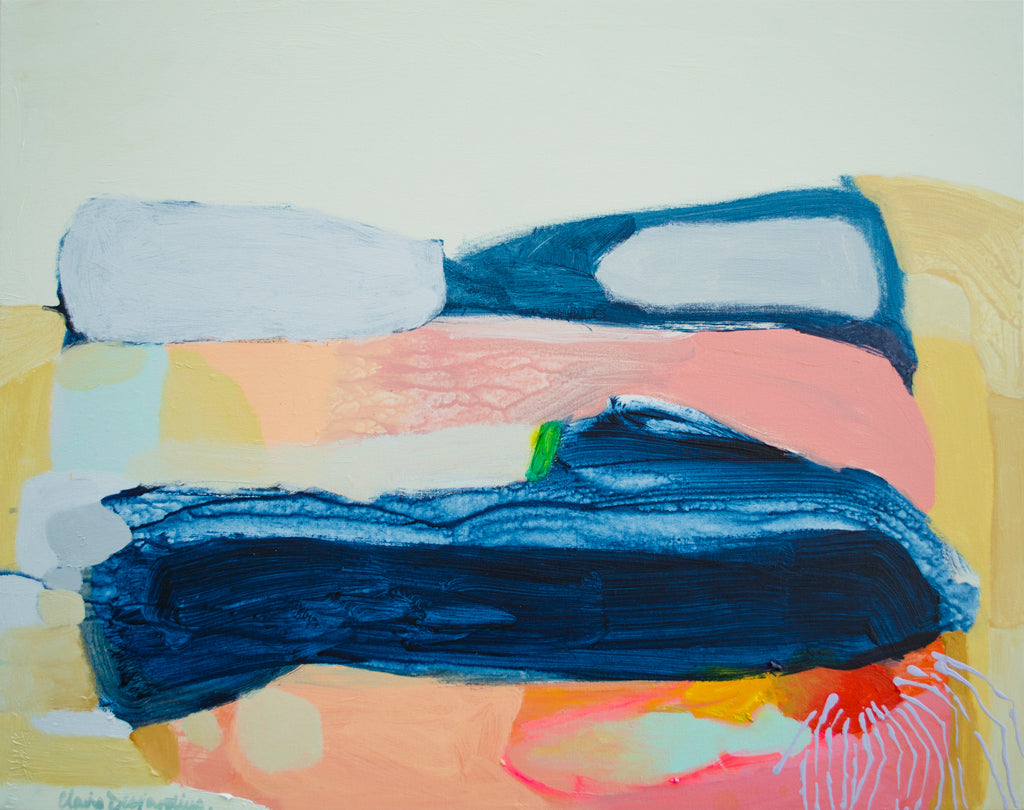
Explore Value
Value refers to the lightness or darkness of a color. Incorporating a wide range of values into your painting can add depth and dimension. Try juxtaposing areas of light and shadow to create dramatic contrast and draw the viewer's eye across the canvas.
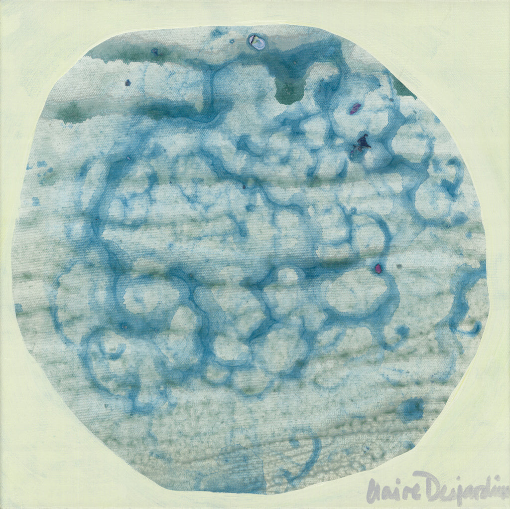
Experiment with Texture
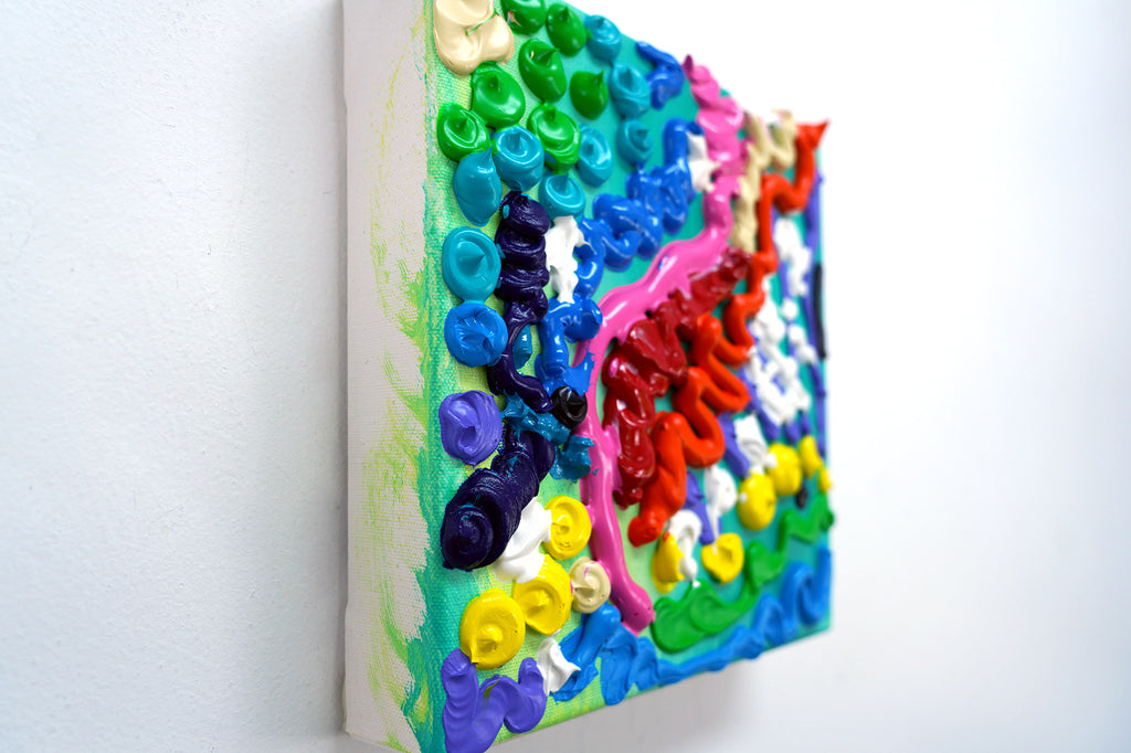
Texture can add tactile interest to your paintings and enhance the overall composition. Mix different painting mediums or experiment with techniques like impasto (thick, textured application of paint) to create contrast between smooth and rough surfaces. You can also use unconventional tools like sponges, palette knives, or even your fingers to add intriguing texture to your work.
Contrast in Scale
Play with scale by incorporating elements of varying sizes into your composition. Contrast large, bold shapes with smaller, delicate details to create visual balance and intrigue. This can help guide the viewer's gaze and create a sense of movement within the painting.
Embrace Negative Space
Don't overlook the power of negative space – the areas of the canvas left untouched by paint. By strategically leaving areas of the canvas blank, you can create contrast between positive and negative space, adding visual interest and allowing your other elements to shine.
Remember, there are no hard and fast rules when it comes to art – feel free to experiment, take risks, and trust your instincts. The beauty of abstract painting lies in its freedom and spontaneity, so don't be afraid to let your creativity run wild!
By incorporating contrast into your abstract paintings, you can create truly stunning works of art that demand attention and leave a lasting impression. So go ahead, grab your brushes, and start experimenting – the possibilities are endless!